People are visual beings. Much more visual than we think. Color plays a huge role in marketing. For instance, the different colors used in a brand’s branding can affect the reputation, the audience.
The bottom line is that color in advertising or the corporate style of a brand affects emotions, decision-making, consumer attitude towards the brand and its products in general. All of these things happen on a subconscious level. The task of the marketer and designer is to choose a color that will be associated with your activity and increase conversion, and not vice versa.
According to international studies, in 85% of cases, color influences the decision to purchase. People pay attention to color ads 26% more often than black and white. To prove that color is a powerful marketing weapon.
The psychology of color is one of the most interesting and controversial aspects of marketing, mainly because of the depth of analysis. Color theory is a complex topic, with a lot of pitfalls and nuances, but in marketing it is most often presented in the form of bright infographics and articles about “selling” color.
What is the psychology of color? Color psychology is the study of how colors and their shades affect human perception and behavior. In marketing and branding, it helps determine how colors affect consumers’ impressions of a brand and whether they convince them to prioritize specific brands or make purchases. This is an area of study worth considering when starting a new business or rebranding an existing one.
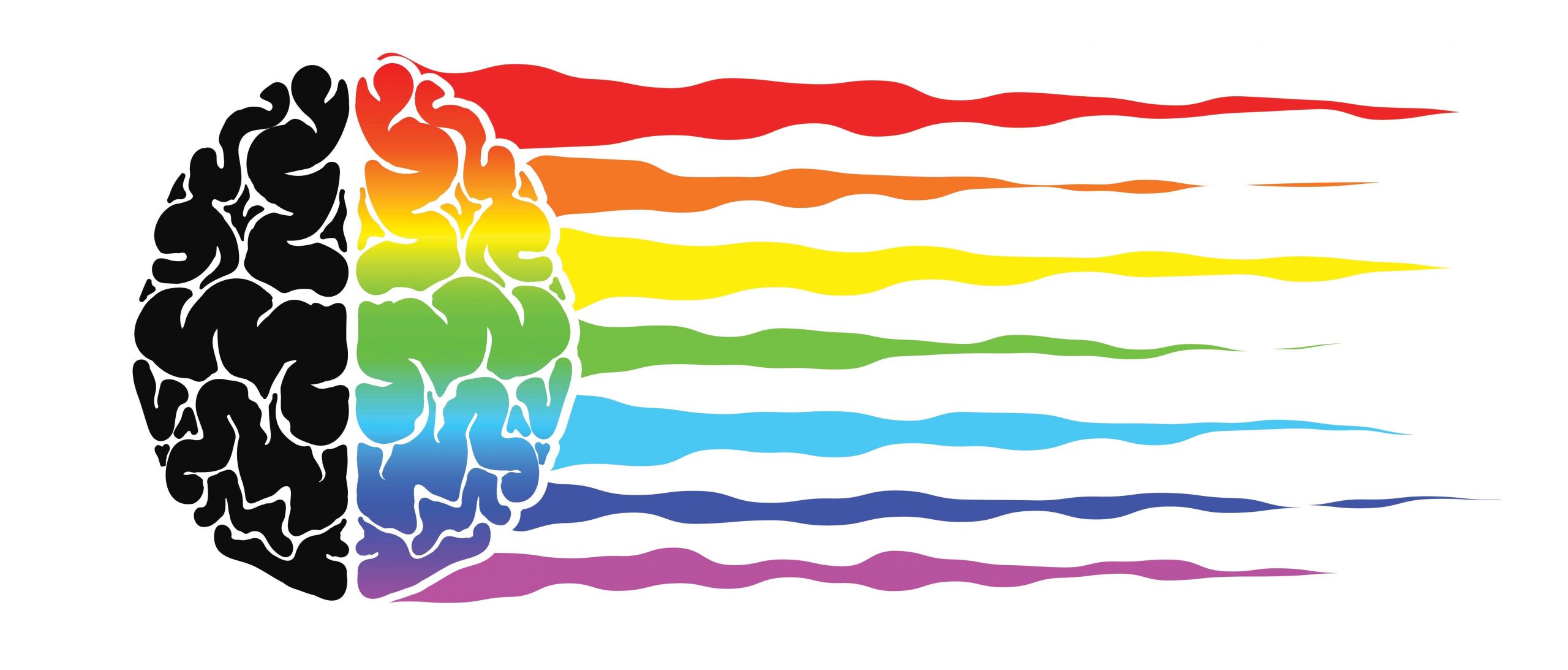
Color psychology in marketing and branding
There are many classifications of brands based on colors and reactions to them. However, the perception of color depends on personal experience and cannot reflect any emotion so concretely and unambiguously. The study confirms that different experiences, peculiarities of upbringing and culture, as well as the context so strongly distinguish us from each other that they almost completely exclude the possibility of equally influencing the subconscious of a group of people with separate colors.
We all can remember the popular phrase “green is the color of tranquility.” Without context, it is difficult to understand whether one can agree with this statement, and practice shows that green is used to convey completely different semantic shades. Let’s remember brands with green logos: Green color for Green Peace means sustainability, for Starbucks for natural and Lacoste for luxury. Or the multi-functional and popular color is brown: it can be used to create a sense of luxury and appeal like Lamborghini, Porsche and Louis Vuitton do, or to create a soft, enveloping and elegant effect like M & M’s, Chocolate Girl, Dove Chocolate.
How to make practical color decisions in your brand?
When choosing corporate colors, we run into a problem: there is no specific applied instructions for choosing a color for a brand. Yes, it would be nice to just look at the infographic and make the right decision, but in reality, it doesn’t work that way. Too much depends on context, so your brand’s feelings, emotions, and image matter more when choosing a color than generic infographics. Fortunately, color psychology can still help you.
Research has shown that the relationship between brands and colors depends on how important the color is for a particular brand. When it comes to choosing the color, research says that matching colors is even more important than the color itself.
Remember: the color should demonstrate the uniqueness of the brand. The influence of color gamut on buying intentions has been proven by research on the importance of color in marketing. Colors affect how shoppers perceive a brand’s personality. And while colors generally reflect certain emotions (for example, yellow reflects joy), research says colors should create a brand image, not try to maintain stereotypical color associations. Most often, a brand stands out with one dominant feature, in rare cases – two. Therefore, determine what your brand should be and what emotion it should broadcast before choosing its color.
Color should appeal to your target audience
The search demonstrates preferences for certain colors by gender and age. It is important to note that the majority of the respondents are from Western countries, because cultural characteristics and the environment leave an imprint on the perception of color. Other searches on color preference suggest that men prefer brighter shades of color, while women are more likely to prefer subdued ones. In addition, men are more likely to choose dark tones, while women are more likely to choose light ones.
Color should differentiate your brand
Research has shown that we love recognizable brands. This means that in order to introduce new brands to the market, it is important to choose colors that provide a difference from the leading competitors in the niche. If you choose the right color, it will help your brand to be unique and stand out.
According to the results of the experiment, the red button color increased the conversion by 21%. Will red make a sale for absolutely everyone? No. It’s all about context. The site interface is made in shades of green, which means that green as a call to action merges with the environment, and red provides contrast.
The color must have a name
While colors can be perceived in different ways, their names do matter. Research has shown that fancy color names are easier to remember and more enjoyable. So, testing was carried out for the same shade under different names: “Mocha” and “Brown”. The first option was preferred by the majority of the respondents.
Which color should you choose?
Choosing the perfect colors for a logo, packaging design, or landing page can take a long time. In any case, this should not be a spontaneous decision.
Use the color matching tool to match different color combinations until you find the combination that best reflects the psychology of your brand. Once you’ve decided on the right colors, test them out with your audience.
In conclusion, colors have a profound effect on consumers’ perception of goods and services. In addition to the colors themselves, their correct combination is also important. The interpretations listed in the article are not the ultimate truth; in practice, you can encounter a large number of nuances. Before deciding on the choice of color, you need to ask yourself the question – what problem does your product solve and what emotions should the client experience?
There is no one-size-fits-all color matching cheat sheet for your brand, each case is unique and largely depends on the context, the values conveyed, and the challenge of standing out from the competition. When thinking about your corporate identity, look not to infographics, but to serious research to gain a strong theoretical base and in practice challenge the preconceived notions of color, creating a unique brand image.